SLC air quality - five years on
Background on SLC air
For those unfamiliar, Salt Lake City is famous for its exquisite natural beauty, and its winter temperature inversions. These events trap emissions in the valley and make life unpleasant. For the uninitiated, see here and here. The focus of today’s post will be digging into five years of PM2.5 data in SLC, as this type of inversion-exacerbated pollutant is most frequently linked to negative health outcomes. Check out this episode from 2016 (image from here):

Get the data
The data we’ll be using for the analysis comes from the UDAQ via the EPA, which keeps detailed air quality data for various sites in SL County. This post will grab data from Hawthorne Elementary (site 490353006) in SLC proper, as that site is noted as being the most accurate in the valley (and is actually the site used to determine whether the valley meets EPA standards).
The hourly data for Hawthorne Elementary only goes back to 2013, so we’ll pull the entire dataset from here (you’ll have to register) with these parameters:

Analysis
We’ll be working with R and the tidyverse.
Load in the data
library(tidyverse)
df <- read_csv('../data/SLCPM2_5/SLCHawthorne_PM2.5_Hourly_2013-2017.csv')

# Look at the data
print(df, n = 5)
## # A tibble: 59,736 x 25
## Latit… Longi… Datum `Hor… `Sta… `Cou… `Sit… `Par… POC `AQS… `Date Loc…
## <dbl> <dbl> <chr> <dbl> <int> <chr> <int> <int> <int> <chr> <date>
## 1 40.7 -112 WGS84 24.3 49 035 3006 88101 1 PM2.… 2013-03-20
## 2 40.7 -112 WGS84 24.3 49 035 3006 88101 1 PM2.… 2013-04-13
## 3 40.7 -112 WGS84 24.3 49 035 3006 88101 1 PM2.… 2013-03-21
## 4 40.7 -112 WGS84 24.3 49 035 3006 88101 1 PM2.… 2013-04-30
## 5 40.7 -112 WGS84 24.3 49 035 3006 88101 1 PM2.… 2013-02-05
## # ... with 5.973e+04 more rows, and 14 more variables: `24 Hour Local`
## # <time>, `Date GMT` <date>, `24 Hour GMT` <time>, `Year GMT` <int>,
## # `Day In Year GMT` <int>, `Sample Measurement` <dbl>, `Units of
## # Measure` <chr>, `Sample Duration` <chr>, `Sample Frequency` <chr>,
## # `Detection Limit` <int>, `Measurement Uncertainty` <chr>, `Qualifier
## # Description` <chr>, `Method Type` <chr>, `Method Description` <chr>Around 60k observations for the five year period and lots of columns we don’t need. Let’s simplify this dataset and look again.
# Convert date and time columns into one column
# TODO: Convert this to dplyr syntax
df$DateTime <- as.POSIXct(paste(df$`Date Local`, df$`24 Hour Local`),
                          format="%Y-%m-%d %H:%M")

# Rename column to avoid spaces
df <- rename(df, Measurement = `Sample Measurement`)

# Grab only 1-hr readings, remove readings of PM2.5 below 0
df_slim_hourly <- df %>%
  filter(`Sample Duration` == '1 HOUR' & Measurement >= 0) %>%
  arrange(DateTime) %>%
  select(DateTime, Measurement) # Grab only necessary columnns

print(df_slim_hourly, n = 5)
## # A tibble: 57,483 x 2
## DateTime Measurement
## <dttm> <dbl>
## 1 2013-01-01 00:00:00 27.7
## 2 2013-01-01 01:00:00 19.2
## 3 2013-01-01 02:00:00 18.9
## 4 2013-01-01 03:00:00 18.5
## 5 2013-01-01 04:00:00 26.7
## # ... with 5.748e+04 more rowsFairly simple time series setup here–nice. But more cleaning is necessary. To further simplify the analyis, let’s combine measurements from multiple intra-hour readings at the Hawthorne site, such that there’s just one per-hour.
df_slim_hourly <- df_slim_hourly %>%
  na.omit(Measurement) %>%
  group_by(DateTime) %>%
  summarise(Measurement = mean(Measurement))
That takes us down to ~42k rows over five years.
Time series for 2013-2017
Now let’s take a look at the five year time series. We’ll use a log y-scale, such that the high-pollution outlier days don’t dominate the visualization.
library(ggplot2)
library(scales)
ggplot(data = df_slim_hourly, aes(x = DateTime, y = Measurement)) +
  geom_point() +
  labs(title = "Hourly PM2.5 in SLC from 2013 - 2017") +
  scale_y_log10(name = "PM2.5 µg/m3",
                limits = c(1,NA),
                breaks = c(1,20,40,60,80,100)) +
  scale_x_datetime(name = "Year",
                   labels=date_format("%m-%Y"),
                   breaks = date_breaks("1 year"))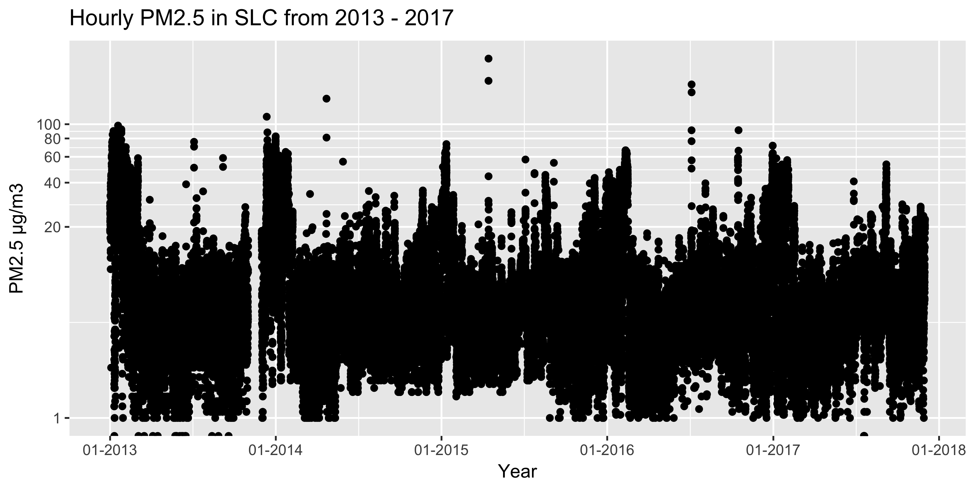
This is daily data, so it’s messy, but it seems that the winter peaks are becoming less peak-y. Hmm. Let’s try to nail down the trend with a little more rigor.
Periodicity in the data
To understand the trend, we first have to grapple with seasonality. To find seasonality (or cyclic patterns in general), the fast fourier transform is a fantastic tool that essentially turns a time domain into a frequency domain. There are several ways to do it–we’ll keep it simple via the r stats package.
First, we remove any nulls and pull the measurement vector from the tibble. Note that because Nov 2013 is missing hourly data, we’ll use data from 2014-2017 for this section.
# Order sample vector by date
measurement_vect_hourly <- df_slim_hourly %>%
  filter(DateTime > '2013-12-31') %>%
  arrange(DateTime) %>%
  pull(Measurement)
Now we compute the spectral density and switch from frequency to periods (borrowing from here)
spectral_data <- stats::spec.pgram(measurement_vect_hourly, plot = FALSE)

# Grab what we need from the raw output
spec.df <- as.tibble(list(freq = spectral_data$freq,
                          spec = spectral_data$spec))

# Create a vector of periods to label on the graph, units are in days
days.period <- rev(c(1/4, 1/2, 1, 7, 30, 90, 180, 365))
days.labels <- rev(c("1/4", "1/2", "1", "7", "30", "90", "180", "365"))
# Convert daily period to daily freq, and then to hourly freq
days.freqs <- 1/days.period * 1/24
Let’s plot the spectral density via a smoothed periodogram, which shows the frequency of reoccuring patterns. Quick, before looking, think of what cycles you’d expect to see!
ggplot(data = spec.df, aes(x = freq, y = spec)) +
  geom_line() +
  labs(title = "PM2.5 Power Spectral Density 2014-2017") +
  scale_x_continuous(name = "Period (days)",
                     breaks = days.freqs,
                     labels = days.labels) +
  scale_y_continuous(name = "Power spectral density")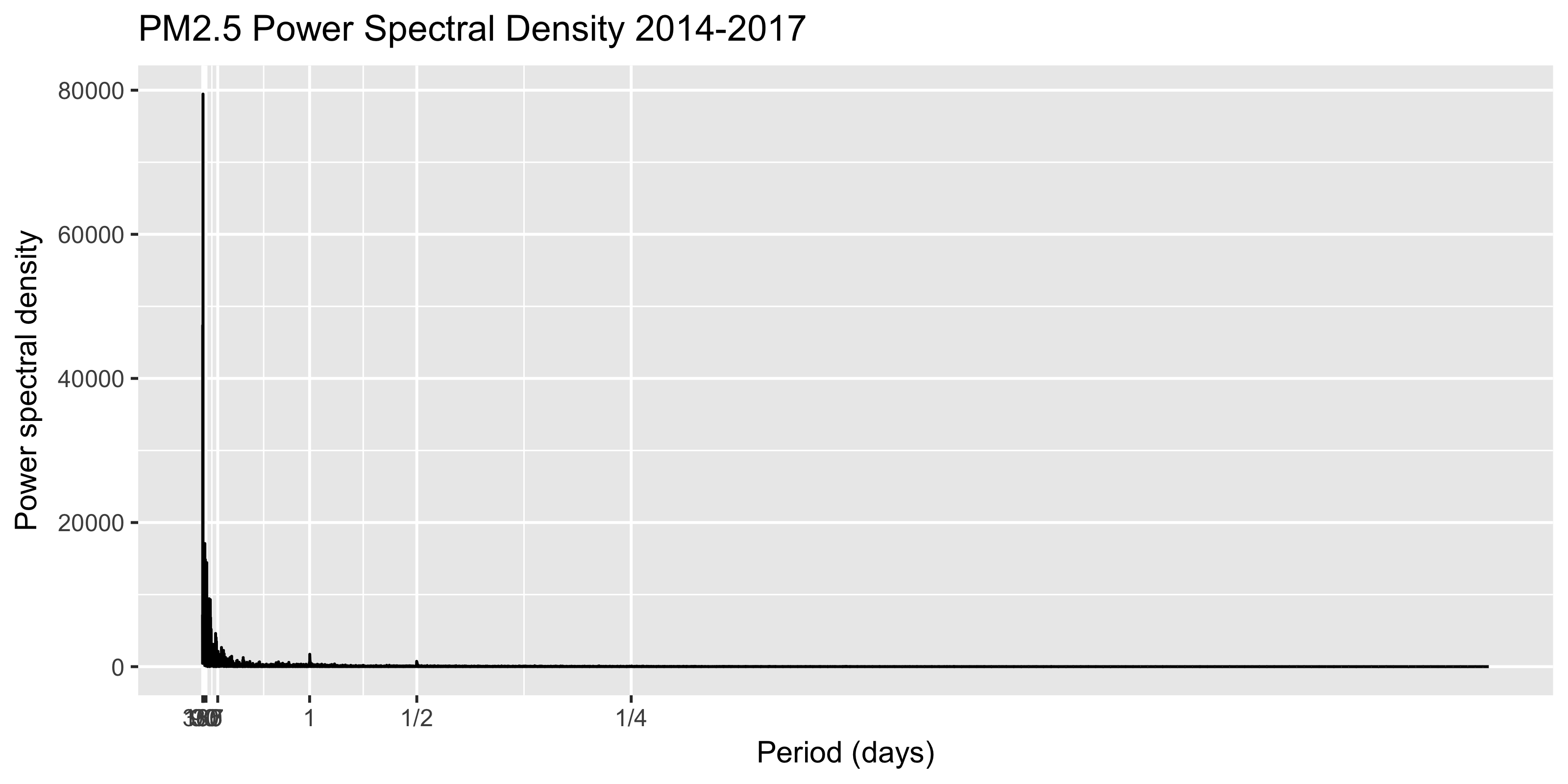
First, note that the X-axis starts at 365 days. While it’s a bit messy, we see diurnal (i.e., daily) and minimal half-day patterns emerging. This would align with intuition, as factories, furnaces, and vehicle traffic would certainly ramp up roughly on a daily cycle.
The half-day emissions cycle also makes some sense, as there are roughly two intuitive times each day when PM2.5 would spike–when factories/furnances ramp up along with the morning commute, and a discrete spike matching the evening commute.
Note the ~yearly pattern is pronounced, and not just occurring on a strict 365-day cycle, which makes sense. Now let’s use log-10 axes to see if the plot is easier to read.
ggplot(data = spec.df, aes(x = freq, y = spec)) +
geom_line() +
labs(title = "PM2.5 Power Spectral Density log10-log10 2014-2017") +
scale_x_log10("Period (days)", breaks = days.freqs, labels = days.labels) +
scale_y_log10("Power spectral density")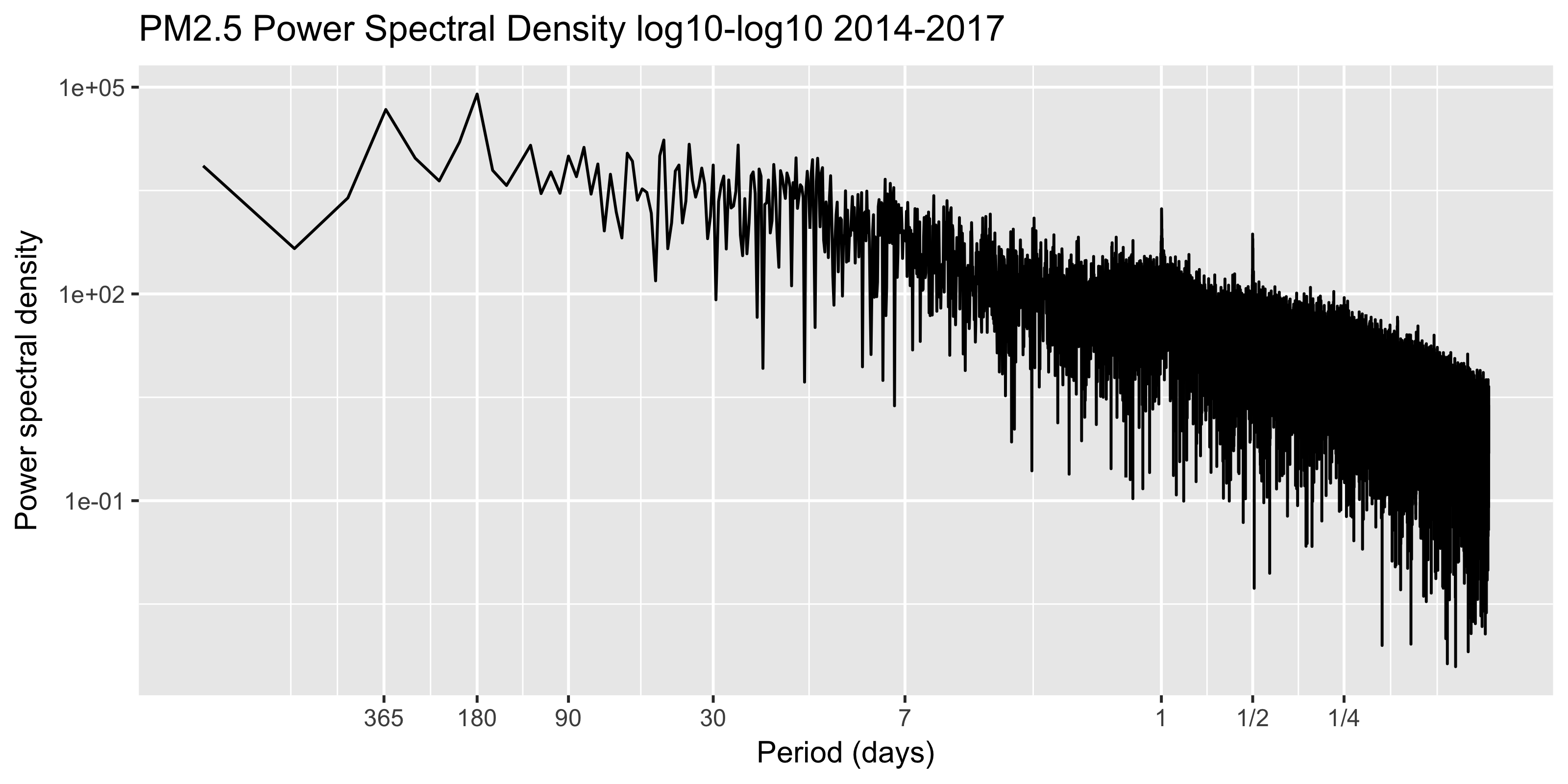 While it’s certainly a bit messy, the half and full day cycle are still pronounced, while the one-year cycle is harder to pick out. There is some sense to this, as the winter inversions certainly aren’t consistent in their arrival or duration.
Breaking out the trend and the seasonality
Now let’s think about removing the seasonality from the data, such that we can get at the trend. Fortunately, this is still straightforward in R.
To simplify the analysis, let’s go back and grab the daily data (instead of hourly) from 2013-2017
df_slim_daily <- df %>%
  filter(`Sample Duration` == '24 HOUR' & Measurement >= 0) %>%
  mutate(DateTime = as.Date(DateTime)) %>% # Switch to Date
  rename(Date = DateTime) %>%              # Remove time column
  arrange(Date) %>%
  select(Date, Measurement)                # Grab necessary columns

# Prepare vector for seasonal decomposition
measurement_vect_daily <- df_slim_daily %>%
  arrange(Date) %>%
  pull(Measurement)
While there are many ways to do this, we’ll keep it simple and use the stats package’s stl function to separate the seasonal component from the secular trend. See more via ?stl.
# Convert measurement vector to time series object
measurement_ts <- ts(measurement_vect_daily,
                     start=c(2013,1,1),
                     frequency = 365.25)

# Perform decomposition into trend, seasonal, etc
# Higher values of s.window make seasonal component more static
stl_slim <- stats::stl(x = measurement_ts,
                       s.window = "periodic")

# Put trend back into daily tibble
df_slim_daily$Trend <- stl_slim$time.series[,'trend']

# Show data
head(df_slim_daily, 4)
## # A tibble: 4 x 3
## Date Measurement Trend
## <date> <dbl> <dbl>
## 1 2013-01-01 23.0 16.3
## 2 2013-01-02 26.5 16.3
## 3 2013-01-03 37.1 16.3
## 4 2013-01-04 41.5 16.2Besides the Date column we have the raw daily Measurements as well as the secular Trend column. Let’s overlay these two to see what pollution progress (if any) SLC has made over the last five years.
Note that the EPA is missing some daily readings from the winter of 2014-2015, so don’t focus on that dip.
# Plot trend over daily data
ggplot(df_slim_daily, aes(x = Date)) +
  geom_line(aes(y = Trend, colour = "Trend"), size = 3) +
  geom_line(aes(y = Measurement, colour = "Daily Data")) +
  labs(title = "PM2.5 Daily Measurements and Trend in SLC from 2013 - 2017") +
  scale_colour_manual(values = c("black", "red")) +
  scale_y_log10(name = "PM2.5 µg/m3",
                limits = c(1,NA),
                breaks = c(1,20,40,60,80,100)) +
  scale_x_date(name = "Year",
               labels=date_format("%m-%Y"),
               breaks = date_breaks("1 year"))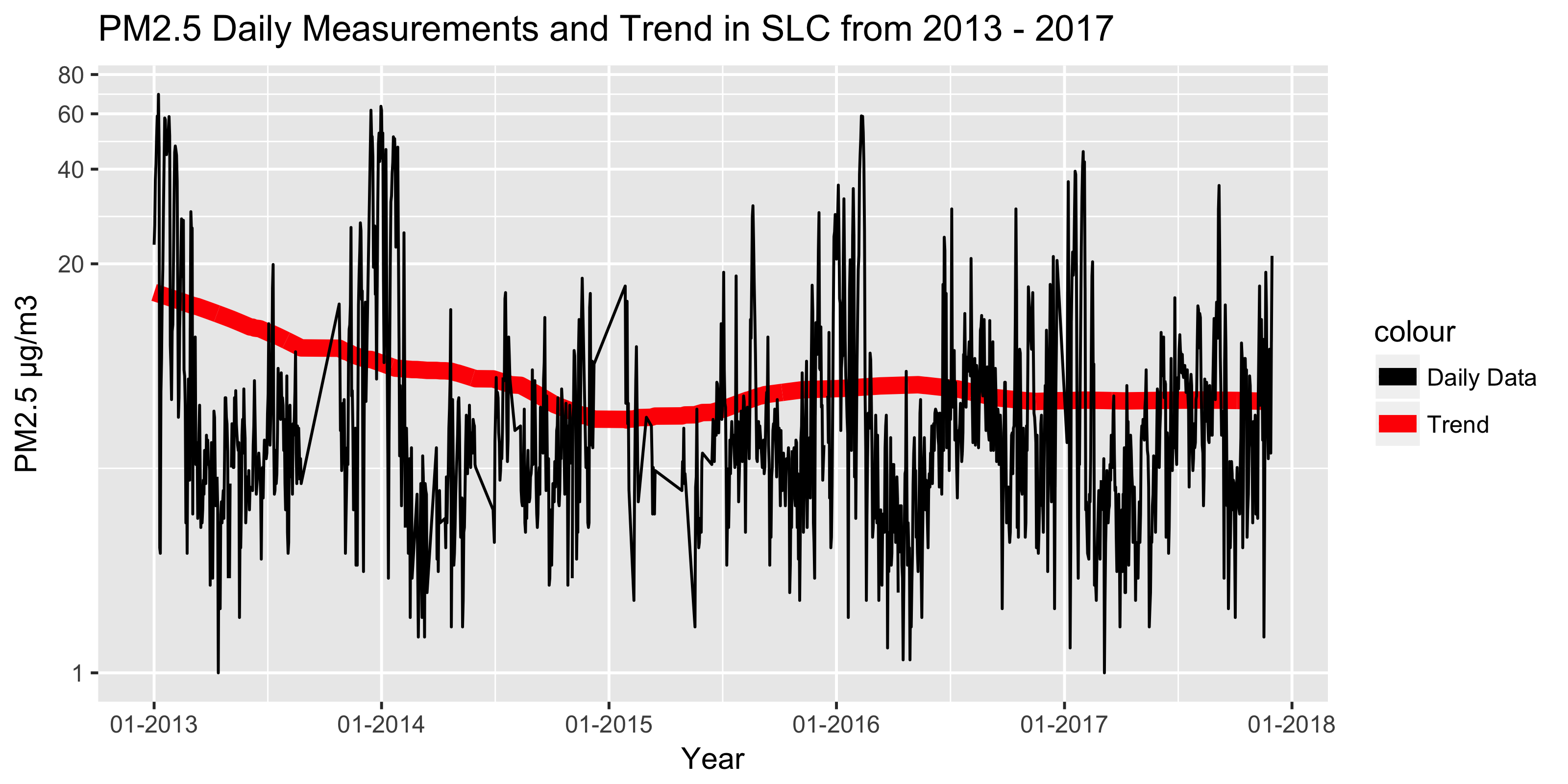
Conclusions
Hooray, perhaps tentative progress! Note that the de-seasonalized daily 2017 PM2.5 values were generally below those of 2013-2014. The improvement appears to be coming from reduced winter spikes, which is great. While the trend isn’t dramatic and I’d love to corroborate with data from other sites, we do at least appear in a better spot than five years ago.
However, we still have issues in SLC
- The downward trend has stalled in 2016-2017; what new policies had started in 2013 that we can double-down on?
- Our “best” PM2.5 site has recent missing data for both 1-hr and 24-hr readings–why?
- Salt Lake County is still classified as a Serious non-attainment area by the EPA.
Non-attainment status comes when areas “persistently exceed the National Ambient Air Quality Standards.” Apparently the county moved from moderate to serious non-attainment because it didn’t meet a 2015 EPA air quality complicance deadline. It’s still unhealthy for folks to spend time outside on certain winter days, and that’s not acceptable.
Next steps
Let me know any issues you find above! Soon I’ll try to nail down the trend with complete daily data from 2013-2017, provide easier year-over-year comparisons, and make this more robust via a 2008-2017 trend with data from multiple sites.
Note that the 2018 session for the Utah Legislature starts on January 22nd!