Simple choropleths in R
Note: post was originally in D3, but I rewrote because I now prefer static figures
Background
I’ve started this blog to help organize my thoughts relative to data science, machine learning, statistics, logic-based analysis, and various visualization tools. The focus will be on data-related tools and techniques. While I’ll keep these posts applicable to a wide (data-interested) audience, I’m sure the analysis will occasionally focus on Salt Lake City, where I’m currently based.
To kick things off, I wanted to show how easy it is to create choropleths with R and choroplethr, showing diabetes rates for each county in the US. For those who love maps and data, choropleths are the holy grail of nerd-dom. If you’re unclear on this, choropleths allow you to take a simple map and essentially lay data on top. Great, right?!
Details
Getting public health data
First, let’s pull 2015 county-level data (in CSV format) from County Health Rankings, which is a fantastic place to analyze state by geographic health differences in the US.
We pull the data into R…
df <- read.csv('../data/2015 CHR Analytic Data.csv')Clean up
# Remove state-summary rows
df <- df[df$COUNTYCODE != 0,]

# Grab only the columns we're interested in--CountyID and Diabetes rate
df <- df[,c("COUNTYCODE", "STATECODE", "Diabetes.Value")]

# Encode for choroplethr
df$COUNTYCODE <- as.integer(df$COUNTYCODE)

# Pad county digits
df$COUNTYCODE <- sprintf("%03d", df$COUNTYCODE)
Create Proper county code
# Concatenate and create FIPS
df$FIPSCODE <- as.numeric(paste0(df$STATECODE,df$COUNTYCODE))

# Reduce dataset and rename cols for county_choropleth func
df_final <- df[,c('FIPSCODE', "Diabetes.Value")]
colnames(df_final) <- c("region","value")
Plot the choropleth
We’ll use a function to make it easily repeatable.
create_choropleth <- function(df, # cols have to be only "region" then "value"
                              title,
                              legend,
                              num_colors=1,
                              NA_replace=NULL) {

  library(choroplethr)
  library(choroplethrMaps)
  library(ggplot2)

  # Fill NA cells with something (so choropleth works)
  if (!missing(NA_replace)) {
    df["value"][is.na(df["value"])] <- NA_replace
  }

  # Plot data on a US map
  county_choropleth(df, num_colors = num_colors, legend = legend) +
    ggtitle(title) +
    theme(plot.title = element_text(hjust = 0.5))
}

create_choropleth(df_final,
                  title = '2015 Diabetes Rates',
                  legend = 'Rate from 0 to 1',
                  num_colors = 7,
                  NA_replace = 0)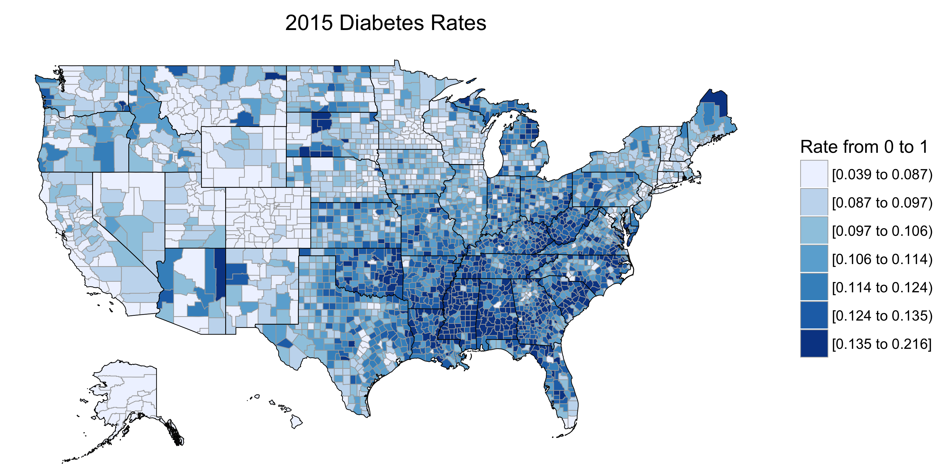
The result
Voilà, a choropleth! Since this isn’t a post on diabetes, we can simply say that the deep south has serious issues with chronic disease.
The beautiful thing about this R package is that you can fairly quickly plot any of the awesome county-level data* you can find here, here, here, or here.
Speaking of maps, if you’re in the market for a US map for the house, you probably can’t do better than this–it was made by one man in a farm house in Oregon.
Note that